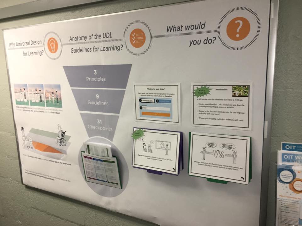
When I joined my instructional design team at my university, in 2017, I wanted to start conversations about UDL design thinking. With the support of my administrator, I took over a bulletin board that everyone in my team walks by several times a day. This was my chance for a first impression and experience with UDL for the team, and I had to make it count.
But wait, it gets worse. My team is responsible, among other things, for LMS support and training. And when I came on board, we were right in the middle of migrating to Canvas from our former LMS. The message not only had to be good, it had to be salient, relevant, and digestable enough to stick when all eyes and brain cells were focused on Canvas...

Ground Rules
The self-imposed ground rules I was working with were:
- I wanted it to be "eye catching" to get people to stop and attend.
- I wanted it to deliver quick content that was memorable and substantial.
- I wanted people to take a copy and and begin to use the UDL Guidelines.
- I wanted to "rethink" what a bulletin board could do... from being a one-way communication device, to an interactive space.
- I wanted to explicitly connect UDL with Canvas (LMS) to increase immediate relevance.
In reflection, I am really happy with how it turned out, and how it really did prompt conversations to begin.
Layout
On the Left Side, I focused on two main ideas with graphic support:
- Addressing differences is most efficiently and effectively done through addressing the environment, not the individual.
- What is necessary for some is almost always good for everyone.
In the Center, the "Anatomy of the Guidelines" was depicted as a sort of sectional inverted triangle going from principles (broadest) to guidelines and checkpoints (most focused), just as they are organized in the hierarchy of the UDL guidelines. We then stapled a simple folder to the board and stapled its sides so that we could put copies of the guidelines inside for people to take.
Finally, on the Right Side, we again stapled folders to the board, but left the sides open so the folders could swing open, upward. I installed a page protector on the outside and in the inside of the folders. Then, we put a common barrier (e.g., "students vary in terms of relevant knowledge that they bring into a lesson.") and one way that this barrier can be addressed by proactive design (in Canvas, in my case). Finally, there was a link and a QR code for people to submit other ideas.
These barriers and solutions rotated on a weekly basis for several weeks.
Interaction
In addition to conversations that occurred around the board in the hallway, people contributed to the weekly idea sharing. On Friday, we voted for the best solutions, and the winner would get a small gift card for a campus coffee shop as a small incentive.
Finally, I prepared executive feedback for everyone each week, commenting on the process of identifying solutions by design, and noting strengths or opportunities for learning from the submissions the prior week.
Try it out!
I would love for others to make use of this work. Please feel free to take my materials, which include early drafts, the final layout for printing, several scenarios and solutions, and examples of the kind of feedback I offered. Feel free to adopt or adapt for your setting. Would you let me know how it goes if you do?
Thank you for sharing this wonderful bulletin board and materials!!